

Before you build a dashboard...
What’s the "one thing" I want them to notice and never forget?


If you’ve seen any Disney movie, Lion King, Moana, etc., you will understand why they have most people, especially kids, in a chokehold.
Nothing is random; everything tells a story: the costumes, the makeup, ALL the colors, the music, the animations, everything. They create an experience that feels real, and maybe that’s why they are a multi-million-dollar company
They sell a story and the illusion of magic, and this controls your attention.
As an analyst, your dashboard should do the same. When building a dashboard, focus on this: what one thing is the most important on this dashboard?
Certainly not the colors or 10 charts. They contribute to the overall feel, but let’s be honest, you lose attention and your audience after the 5th chart and all the theatrics. They scroll without absorbing anything or pick up their phones.
A dashboard should support your data, points, and analysis. That’s what this article is about: Guiding your audience through a journey, just like Disney.
Your first question should be: What is the one takeaway from this dashboard?
Take a look at Charles Minard’s iconic first chart from 1869, one of the finest early examples of multivariate data graphics and a timeless case study in how data can illuminate history.
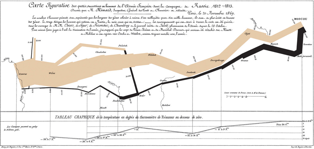
It shows the number of men in Napoleon’s 1812 Russian campaign army, their movements, and the freezing temperatures they encountered on the return path. It’s an iconic example of what a good viz should be: simple, detailed, and clear.

Dashboards are overrated
Yes, there are too many dashboards, and I am guilty of building some of them that don’t convey any meaningful information. (Except for educational purposes).
If you’re building dashboards just to show ALL the metrics, add slicers and filters, and 10 more tabs, with no clear takeaways, then come closer: it doesn’t show maturity as an analyst.
CEO mode
If your dashboard is shown on screen to Sam Altman (yeah, right?) for just 3 seconds, with one eye on Slack and one foot out the door, will he stop in his tracks to look at it?
If you’ve ever opened a dashboard and closed that tab within seconds, why did you do that? What happened?
When building dashboards, think for the moment and build for the future.
6 simple but powerful things for your dashboard
1. Start with a headline, not just a title
I am guilty of using generic titles, maybe because they were built for learning and upskilling.
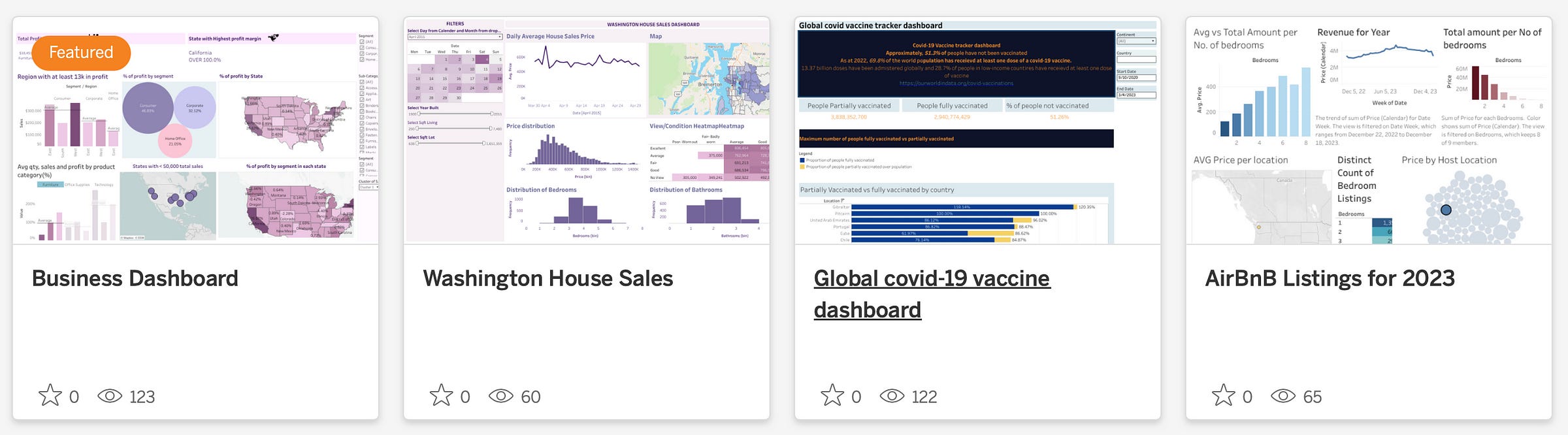
“Business dashboard” or “Airbnb Listings for 2023” is not a very good title, and you can agree with that.
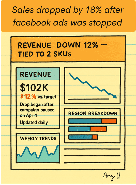
But if you check my dashboard and see: “Sales dropped 18% after I stopped Facebook Ads”, now we have a story, and I may have your attention.
Why facebook Ads?
What happened?
Your dashboard should open with a punch, a hypothesis that makes people lean in, even if for a second, and not gloss over it.
Sample title and chart template:
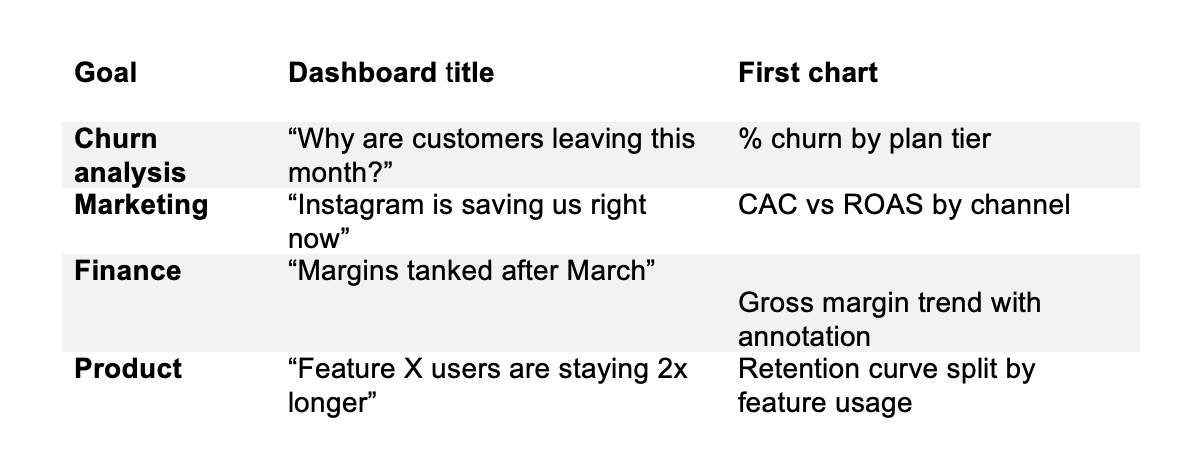
Titles should be like headlines and communicate the dashboard message.
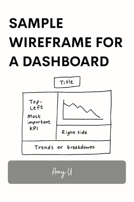
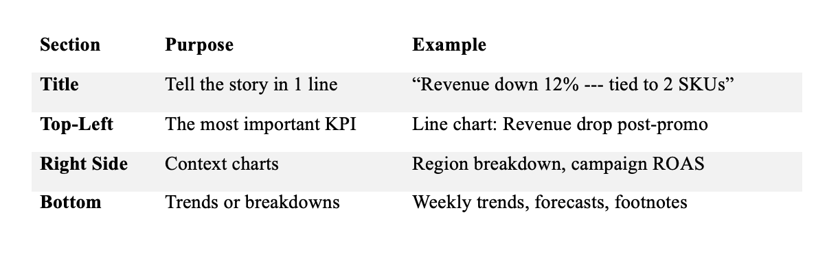
2. Top-Left is the decision corner
The top-left quadrant of your dashboard should have your KPI cards. Don’t bury them at the bottom or in tab 3.
Most people read from top left to right, and your most important metric or lead chart should be placed there (unless otherwise stated).
Additionally, a microcopy or tooltip can take your dashboard from a dashboard to a tool for strategy and information.
Add something like this:
Revenue: $102K ⬇ 12% vs target
Drop began after campaign paused on Apr 4
Updated daily
3. Filters should clarify, not confuse.
Not everybody knows what “Segment Q2, WK 46” means, so label all your filters. Even some Google Analytics users get this wrong.
Use real labels like:
Region: [North America]
Segment: [Enterprise | SMB]
4. Are your charts answering questions or creating problems?
“Revenue by Region” might be vague. It raises more questions
what region?
Positive or negative revenue?
However, a question like “Where are we losing revenue?” points the dashboard to areas with losses, helping you build your presentation from there and guide curiosity.
5. Use colors with intent
The first rule of a dashboard should be: Use only 3 colors. And I would have to force myself to believe that.
You can conflict insights and data if you don’t use colors with care.
Green mostly means good or a gain on dashboards
Red signifies a drop or a bad thing
Blue could be neutral or represent categories.
You want to keep this distinction obvious so you don’t confuse your audience.
Use colors that bring focus and are easy on the eyes. A good practice is using a color scale tool. Tools like Coolors.co or ColorBrewer2 can guide you in creating color-matching patterns and help you blend the colors you use.
6. Dashboard layout
It’s optional and underrated, but sketching your dashboard can help you avoid going haywire.
You can sketch to give you a visual before building it. I sketch with paper, but digital tools like Figma, Excalidraw, or Canva are great for wireframing.
A blueprint layout I use:
Insights begin with dashboards or presentations. Your presentation should guide actions clearly without causing confusion. It should be an interface between insight and action. Let the audience see the dashboard and think:
“Churn really spikes in week 3,” or “We’re spending more here than here.” Let people feel the need to make a decision; keeping things simple can encourage them to engage and learn more.
Don’t build dashboards for data, build them for decisions.
Get the free dashboard design toolkit and workflow: dashboard design toolkit
Be data-informed, data-driven, not data-obsessed
🔗 Connect on LinkedIn and GitHub for more data analytics insights.
Data analyst⬩Spreadsheet advocate ⬩freelancer⬩turning data into insights
#dashboard #dataanalytics #datascience #tableau #PowerBI #Looker #businessintelligence #datavisualization #dashboarddesign
I love this idea of having questions at the top that direct the viewer to the problem being solved, rather than just having a boring headline. I am going to add this to the new repertoire of the dashboard framework we are building in our team. Apt time for this Ame, thank you!
In another life I wanted to be a data analyst and in this life I've started collecting my personal data to build a healthy and deeply connected and fulfilled life. My data collection has been either so overly complicated, jam packed, and complicated that I've dropped off or it's been so simple that there wasn't enough information to derive any conclusions.
I did not understand this entire post but what I did take away is going to help me greatly improve my practice and how I guide people to better track their cycles!! Thank you for this